

Association management has significantly benefited from the advent of data visualization, with visual aids making it remarkably easier for associations to make informed and data-driven decisions.
Using charts, graphs, and interactive reports has transformed complex datasets into understandable insights, enabling leaders to grasp trends, member behaviors, and financial health at a glance. However, the wide array of data visualization tools available has divided associations regarding the best tools to adopt for their specific needs.
Despite this uncertainty, effective data visualization can potentially enhance decision-making processes. In this blog, we'll explore the top 9 data visualization tools, providing a comprehensive guide to help associations navigate their options and select the tools most suited to their objectives.
So, read on to discover everything you need to know about these game-changing resources.
Key Takeaways
- Utilizing charts, graphs, and interactive reports transforms complex datasets into understandable insights. This enables association leaders to grasp trends, behaviors, and financial health at a glance, thus facilitating informed and data-driven decisions.
- With a wide array of data visualization tools available, associations can select the ones best suited to their specific objectives, from enhancing member engagement to streamlining operations and beyond.
- Data visualization software offers extensive customization options, allowing associations to tailor visuals to align with their branding, enhancing clarity, brand recognition, and the overall communication strategy.
- The ability to easily export visualizations in various formats, including PDFs, image files, and interactive dashboards, enables associations to disseminate insights across multiple platforms efficiently, enhancing audience engagement.
- By integrating data visualization tools with Glue Up's association management software, associations can leverage comprehensive membership insights, streamlined financial reporting, and optimized workflows, all within a customizable dashboard.
What is a Data Visualization Tool?

Before discussing the best visualization tools for association management, let's first define a data visualization tool. A data visualization tool is a software application or platform that allows users to create visual representations of data, making complex information easier to comprehend.
With 65% of the human population being visual learners, indicating that most of us need to see information to retain it, the importance of these tools becomes even more pronounced.
These tools transform raw data into visually appealing formats such as charts, graphs, maps, and infographics, enabling viewers to grasp patterns, trends, and anomalies quickly. The primary aim of data visualization tools is to aid in data analysis and presentation, facilitating more informed decision-making processes.
By leveraging these tools, associations, and organizations can analyze their data more effectively, uncover insights, and communicate findings clearly and engagingly. Let's find out in what areas a data visualization tool could help associations enhance their management and decision-making processes.
1. Effortless Member Data Import
Data visualization tools are revolutionizing how associations manage their member information by enabling effortless importation and analysis from various sources, including an association's CRM system, event registration platforms, and member surveys.
These tools simplify the process of gathering and integrating data, ensuring that associations can easily consolidate member information from these disparate sources into a single, accessible platform.
Once imported, the data can be visually represented through intuitive dashboards, charts, and graphs, allowing association managers to instantly identify trends, preferences, and patterns among their membership base.
This seamless integration and visual presentation of data saves significant time and resources and enhances the accuracy of data-driven decisions. By leveraging these capabilities, associations can tailor their services, communications, and offerings better to meet the needs and interests of their members, ultimately leading to increased member engagement and satisfaction.
2. Diverse Visualization Options
Data visualization platforms are invaluable in association management, transforming complex datasets into clear and comprehensible visual representations.
These tools provide various visualization options that cater to different aspects of association management, helping to identify trends, patterns, and insights crucial for effective decision-making.
Below are some diverse visualization options offered by data visualization tools and how they can be applied in association management:
- Bar Charts: Ideal for comparing membership engagement across different events or programs.
- Line Charts: Best suited for tracking membership growth or event registration rate over time.
- Pie Charts: Useful for depicting the distribution of member demographics or resource allocation.
- Scatter Plots: Reveal the relationship between member satisfaction and participation levels.
- Heat Maps: Show the geographical distribution of members or hotspots of activity within the association.
- Histograms: Offer insights into the frequency distribution of member feedback scores or donation amounts.
- Treemaps: Display hierarchical data, such as the breakdown of budget allocations for different departments.
- Network Diagrams: Visualize relationships and collaborations between association members or partner organizations.
- Icon Arrays: Represent member survey responses or volunteer participation rates visually.
- Bullet Graphs: Display the performance of fundraising campaigns against set targets.
- Pictograms: Make annual financial reports more engaging by using icons to represent key statistics.
- Timelines: Provide a historical perspective of the association's milestones and achievements.
Utilizing these visualization options, associations can effectively communicate complex data to their members, stakeholders, and the public.
Whether for internal strategy meetings, annual reports, or member communications, these tools empower association managers to present data engaging and insightfully, enhancing understanding and facilitating informed decision-making in association management.
3. Customization Power
Another significant advantage of data visualization software is its extensive customization for associations. This allows them to tailor the visuals to align with their branding, enhancing clarity and brand recognition.
Associations can leverage custom color palettes that reflect their brand identity across all visualizations, ensuring a consistent look and feel. The ability to select fonts and text styles further personalizes reports and presentations, making them more engaging and professional.
Customization also extends to chart elements, including modifying axes, legends, and labels to improve readability and impact. Layouts and layering options allow associations to arrange data most effectively, optimizing the visual flow for better comprehension.
Moreover, the software often includes features for adding calculations and annotations directly onto the visuals, providing valuable context and insights. This level of customization strengthens the association's brand presence and makes the data more accessible and meaningful to the audience, enhancing the overall communication strategy.
4. Export Flexibility
Data visualization tools significantly enhance the versatility and reach of an association's communication and reporting efforts by offering easy export options in various formats.
This functionality is crucial for associations as it allows them to easily distribute insights and findings across multiple platforms and to different stakeholders.
Here are several key ways through which associations benefit from these export capabilities:
- PDF Reports: For formal reporting or documentation needs, associations can export their visualizations as PDFs, ensuring the layout and design remain intact across all devices and platforms.
- Image Files: Exporting visualizations as image files (such as JPEG or PNG) allows for easy inclusion in presentations, newsletters, or social media.
- Interactive Dashboards: Some data visualization tools allow the export of interactive dashboards as web links. These can be embedded in the association's website or shared via email, providing members and stakeholders with a dynamic and engaging way to explore data and insights at their own pace.
- Excel and CSV Files: For data enthusiasts or members who wish to conduct their analysis, associations can export the underlying data as Excel or CSV files. This supports transparency and enables detailed scrutiny or further analysis by interested parties.
- PowerPoint Slides: Another feature that saves time and ensures presentation consistency is automatically converting visualizations into PowerPoint slides. This is particularly useful for educational workshops, annual meetings, or pitching to potential partners.
These export options streamline information circulation and ensure associations can reach their audience through the most appropriate and effective channels.
9 Best Data Visualization Tools for Data-Driven Associations

Having explored what a data visualization tool is, its benefits, and how associations can use it to enhance their data-driven strategies, it's time to focus on the crux of our discussion. We now present the best 9 tools specifically tailored for data-driven associations.
These tools have been carefully selected based on their functionality, ease of use, and ability to transform complex data into actionable insights. They ensure that associations can not only comprehend their data more deeply but also leverage it to drive their missions forward effectively.
For Non-technical Association Staff
First, we will present data visualization tools particularly suited for the non-technical staff within associations, ensuring ease of use without compromising on powerful analytical capabilities.
1. Tableau
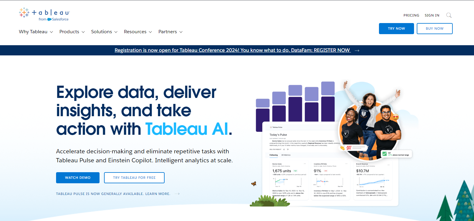
Tableau is a beacon for data visualization, providing a user-friendly platform that caters to technical and non-technical staff within associations. Its intuitive design and potent analytical capabilities allow for seamless data exploration, making it an exemplary tool for organizations aiming to deepen their data comprehension.
AI-Driven Enhancements: Tableau AI, Pulse, and Einstein Copilot
In the age of AI, Tableau is leading the charge by incorporating top AI tools such as Tableau AI, Tableau Pulse, and Einstein Copilot.
These features are designed to streamline decision-making processes and automate repetitive tasks, offering intelligent analytics at scale. This evolution positions Tableau as a transformative tool for associations looking to elevate their data-driven strategies.
Specialty Industries: Broad and Deep Analytics Platform
Tableau is recognized for its extensive, end-to-end data and analytics platform, which serves various industries. Thanks to its comprehensive integration of data management, visual analytics, data storytelling, and collaboration tools, it is the platform for ensuring responsible data usage and achieving better business outcomes.
Accessibility for All: Tableau Cloud and Tableau Prep
With Tableau Cloud, the platform extends its reach by offering analytics accessible to everyone, from any location. Tableau Prep enhances this capability by enabling faster and more efficient data combination, shaping, and cleaning processes.
These features ensure that Tableau's advanced analytics are available to associations of all sizes, facilitating mission-critical data management and scaling.
Learning and Experimentation: Tableau Public
With Tableau Public, everyone can learn how to use it for free, offering a valuable resource for those new to data visualization or looking to expand their skills without any financial commitment. This platform encourages learning and experimentation, making it easier for users to understand and leverage Tableau's powerful capabilities.
Trial Before Purchase: Free Trial Available
Acknowledging associations' diverse needs, Tableau offers a free trial alongside its paid versions, allowing organizations to explore its features thoroughly without immediate financial commitment.
This flexibility ensures that associations can make an informed decision and be confident in Tableau's ability to meet their specific data visualization requirements in an increasingly AI-dominated landscape.
2. Infogram
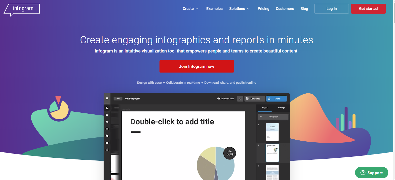
Infogram is an intuitive visualization tool perfectly suited for associations looking to enhance their content creation process. It empowers users to easily design engaging infographics, reports, slides, dashboards, and social media visuals.
The platform's user-friendly interface ensures that creating beautiful, impactful content is accessible to everyone, regardless of their design expertise. Additionally, Infogram facilitates real-time collaboration, allowing teams to collaborate seamlessly and efficiently on projects.
Designer Templates and Brand Consistency
Infogram provides a vast collection of designer templates that can be used as a starting point for any project, from marketing reports to educational slides.
Associations can maintain brand consistency across all their visuals by adhering to company guidelines, ensuring that every content accurately reflects their identity. This feature is crucial for associations to strengthen their brand presence and create a cohesive visual language.
Engaging and Interactive Visuals
With features like animations, interactive charts, and maps, Infogram takes visual storytelling to the next level. Associations can create stunning infographics that capture the audience's attention and help boost the association`s engagement on websites and blogs.
Producing interactive marketing reports and sales figures allows for more dynamic data presentations, making complex information more digestible and engaging.
Live Data Dashboards and Interactive Maps
Infogram dashboards are a game-changer for associations seeking to track and visualize their business or project metrics in real time. By connecting data sources, users can build live dashboards that are easily shareable and provide insightful visual tracking.
Moreover, the platform's map maker enables the publication of professional-quality interactive maps, enhancing how geographical data is presented and understood.
Maximizing Reach on Social Media
In today's digital age, social media is a critical channel for associations to communicate with their audience. Infogram's ability to create captivating social media visuals ensures associations can effectively convey their messages, maximizing reach and engaging members on all social media platforms.
Audience Insights
One of Infogram's standout features is its ability to track how content resonates with the audience. This analytics function allows associations to measure community engagement and adjust their strategies accordingly, ensuring that their visual content consistently meets the needs and interests of their audience.
3. ChartBlocks
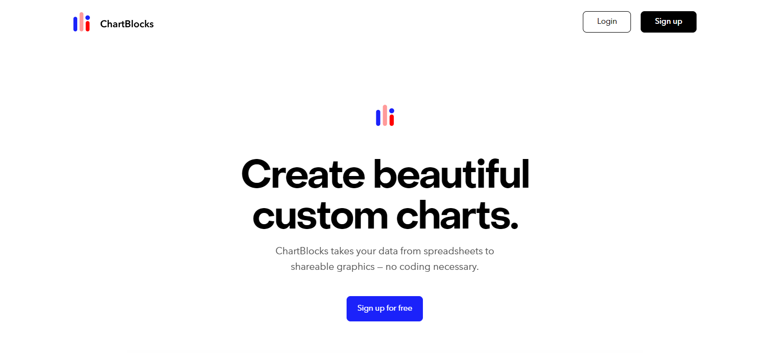
ChartBlocks is an exceptional tool designed to transform how associations visualize their data. By allowing users to create custom charts without coding, ChartBlocks simplifies the process of turning spreadsheets and databases into shareable, visually engaging graphics.
This ease of use is a significant advantage for associations seeking to communicate complex data in an accessible and compelling manner.
Seamless Import and Diverse Design Options
With ChartBlocks, importing data is a seamless experience. Whether your data is stored in spreadsheets or databases or if you prefer to input it directly, ChartBlocks can handle it with ease.
The platform offers hundreds of design options, allowing associations to choose how they present their data story. This level of customization ensures that every chart accurately reflects the message and style unique to the association.
Comprehensive Control and Sharing Capabilities
ChartBlocks stands out for its comprehensive control over every aspect of chart creation. Associations can fine-tune their visuals to meet their needs, ensuring that every chart perfectly aligns with their objectives.
Additionally, the ability to embed charts into any website, integrate with Ceros Studio, or utilize ChartBlocks’ built-in social media sharing tools, enhances the reach and impact of their data visualization.
Versatile Export Options
ChartBlocks' versatility extends to its export capabilities. Associations can take their charts wherever they go, exporting them as editable vector graphics suitable for presentations or optimizing them for high-quality printed documents.
This feature is invaluable for associations that need to present their data across a variety of mediums.
Free Sign-Up and Accessibility
ChartBlocks is not only powerful and versatile but also accessible. Its free sign-up opens the door to its rich features without any upfront cost.
This accessibility ensures that associations of any size or budget can leverage the tool's capabilities, democratizing sophisticated data visualization.
4. Datawrapper
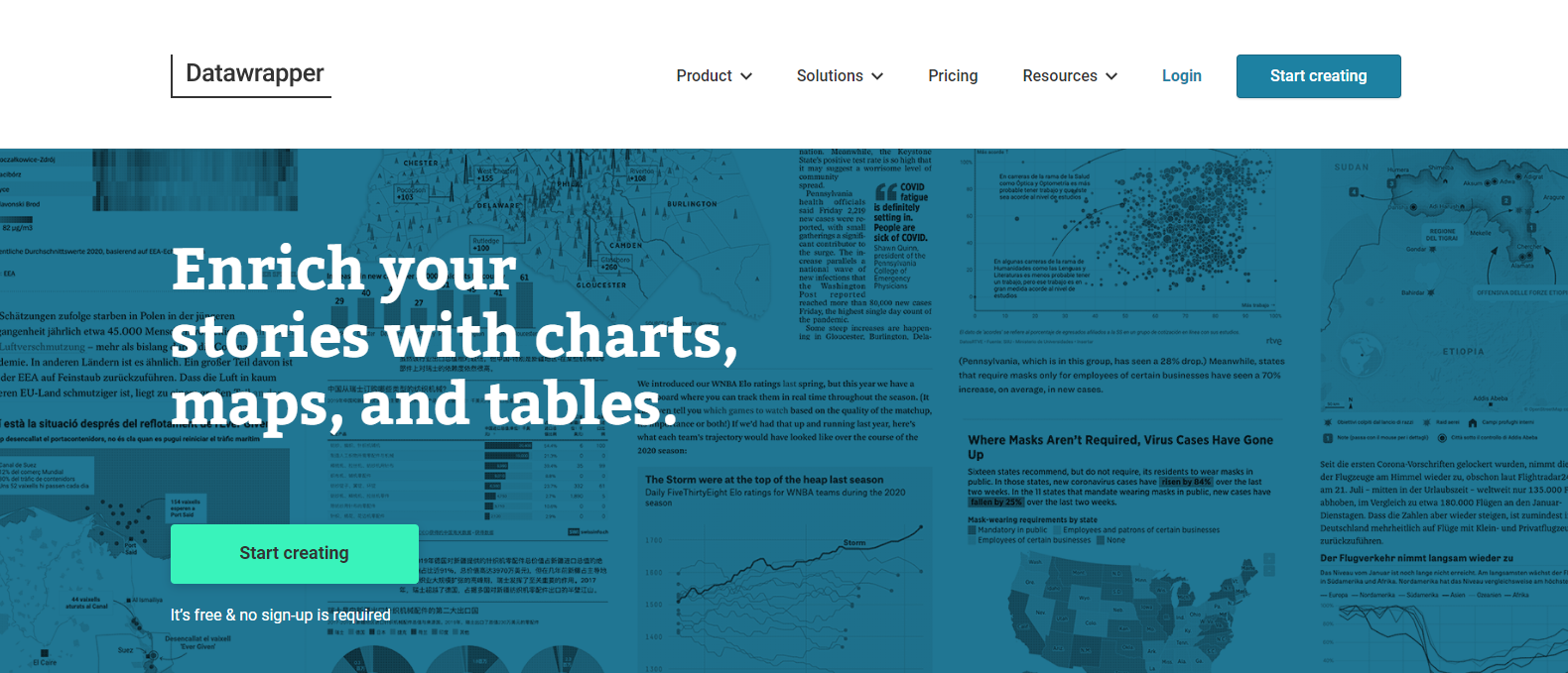
Datawrapper offers a comprehensive solution for associations looking to enrich their stories with interactive and engaging visuals. This tool stands out for its simplicity and efficiency, enabling users to create a wide range of visualizations, including charts, maps, and tables, without the need for coding or design skills.
Its array of 20 interactive and responsive chart types, such as bars, lines, arrow, range, and scatter plots, alongside three map types for locator, thematic choropleth, and symbol maps, makes Datawrapper an incredibly versatile tool for associations aiming to present data in a compelling manner.
Responsive Data Tables and Customization
Beyond charts and maps, Datawrapper's responsive data tables offer extensive styling options. These tables can incorporate bar, column, and line charts, heatmaps, images, and even features like a search bar and pagination, providing a detailed and interactive way to display data.
The ease of customization allows associations to tailor their visualizations precisely to their narrative, enhancing the effectiveness and impact of their communication.
Effortless Data Import and Real-time Updates
Datawrapper simplifies the data import process, allowing users to copy data directly from the web, Excel, or Google Sheets. Additionally, the ability to upload CSV/XLS files or link to a URL or Google Sheets for live-updating charts ensures that associations can keep their visualizations current with minimal effort.
The tool's editing features are straightforward. With just one click, you can select a selection of chart and map types, along with customization and annotation options to refine the visuals further.
Seamless Integration and Collaboration
Embedding or downloading visualizations is hassle-free with Datawrapper, thanks to its responsive embed code that integrates smoothly into CMS or websites, and export options that include PNG, SVG, or PDF formats for printing.
This functionality ensures associations can easily share interactive charts across various platforms, from digital articles and reports to printed publications.
Accessibility and Collaboration for All
Perhaps most appealingly, Datawrapper is free to use, providing unlimited visualizations and fostering collaboration within teams. Its goal is to enable everyone to create beautiful charts, maps, and tables, which democratizes data visualization, making it accessible to associations regardless of their size or budget.
The platform's features, designed to support live updating and teamwork, further emphasize its suitability for associations looking to make data-driven decisions and engage their audiences with up-to-date, interactive content.
For Associations With In-House Coding Expertise
Having explored a selection of visualization tools that empower users to create engaging content without the need for any coding skills, we now turn our attention to the other end of the spectrum.
It's time to present the tools where associations either already possess coding expertise within their teams or find it necessary to onboard such expertise to fully benefit from these more advanced platforms.
5. D3.js
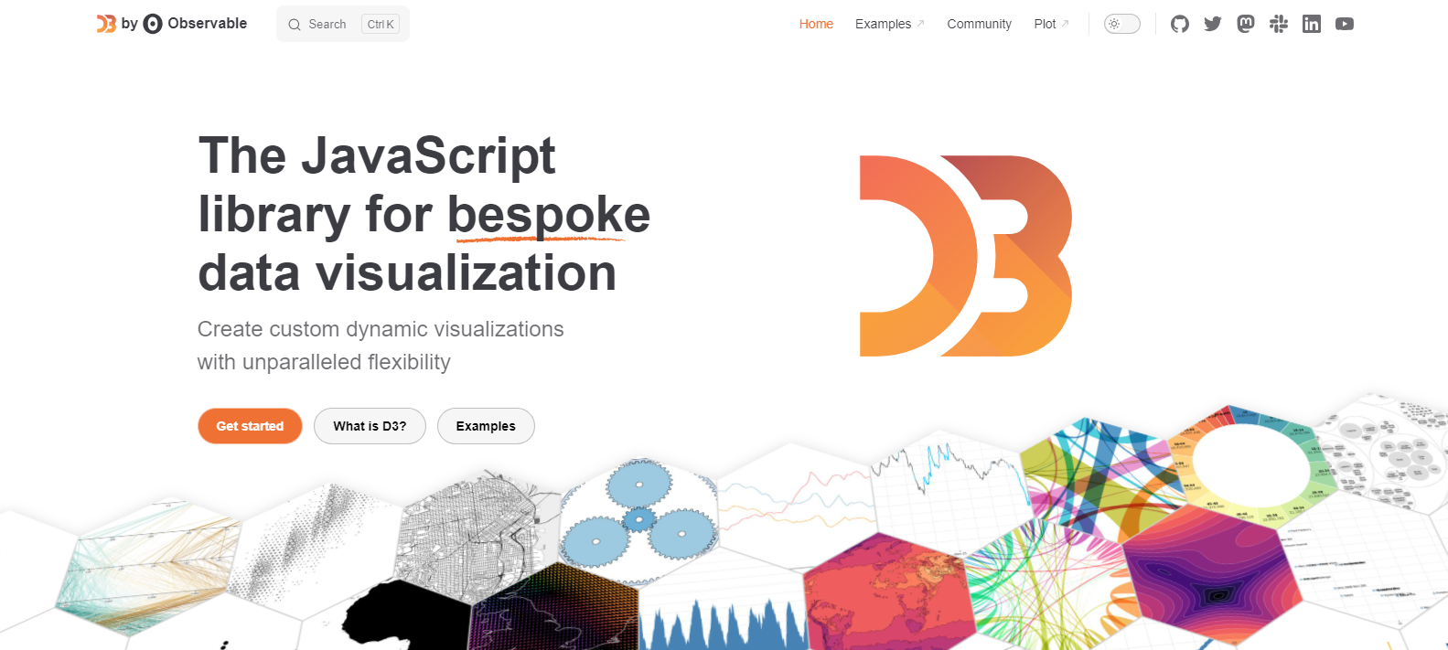
D3.js is a monumental force in data visualization, providing associations with the tools to create custom, dynamic visualizations that boast unparalleled flexibility.
As a free, open-source JavaScript library, D3.js is built on the principles of web standards. It allows for the crafting of highly interactive and data-driven graphics.
This low-level approach has positioned D3 as the backbone for numerous groundbreaking visualizations and a vital component of many higher-level chart libraries, cementing its place as a crucial resource for data practitioners worldwide.
Features of D3.js: Flexibility, Connectivity, and Efficiency
- Bespoke Visualizations: D3.js empowers associations to tailor their visualizations precisely, offering a level of customization that goes beyond the capabilities of out-of-the-box solutions. Whether it's charts, maps, or data applications, D3.js facilitates the creation of unique visual narratives that resonate with the audience.
- Seamless Data Integration: With D3.js, pulling live data from various sources such as the cloud, files, and databases becomes effortless, all without the need for any installations. This feature ensures associations can access and visualize their data in real-time, providing fresh insights as they emerge.
- Optimized Development Process: The library streamlines the coding process, featuring lightweight automatic versioning, instant sharing, and real-time multiplayer editing. These aspects accelerate the development of visualizations, making D3.js an efficient tool for teams working on data analysis projects.
- Collaborative Analysis Environment: D3.js creates a collaborative space for teams to conduct data analysis. Members can quickly generate and iterate on charts, maps, and data applications. This collaborative approach accelerates the exploration and analysis process, enabling associations to uncover valuable insights together.
Empowering Associations with Advanced Visualization Capabilities
For associations that have access to coding expertise, D3.js offers an opportunity to leverage their data in ways that were previously unimaginable.
Its robust features and depth of customization make it ideal for organizations looking to expand the boundaries of traditional data visualization.
By harnessing the power of D3.js, associations can not only present their data more effectively but also engage in more sophisticated analysis, driving innovation and insight within their teams.
6. Google Charts
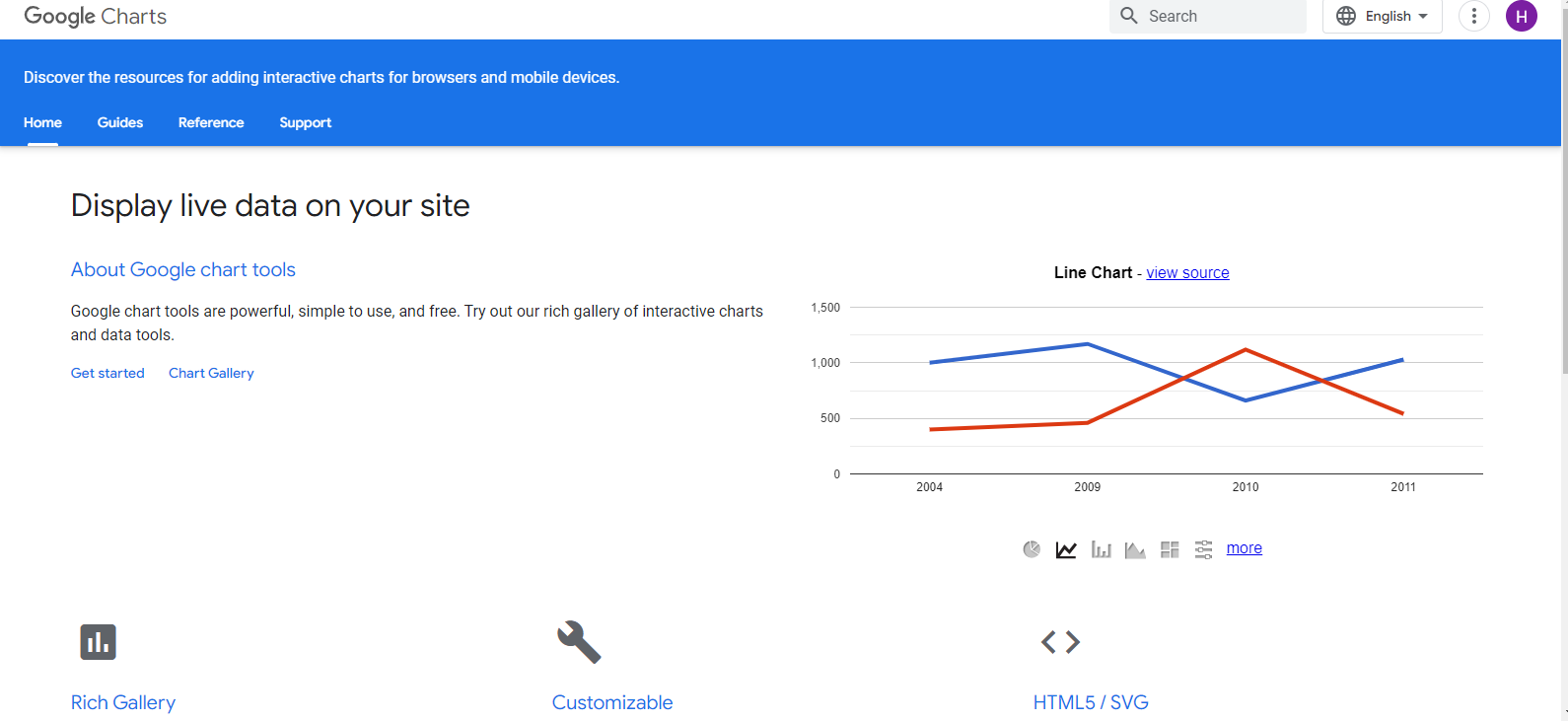
Google Charts provides a versatile and free toolset for creating a wide array of charts and data visualizations directly within the Google ecosystem.
Designed to be easy to use while offering a range of sophisticated charting options, Google Charts is an excellent choice for associations looking to present their data in clear, interactive formats without incurring additional software costs.
Key Features of Google Charts
- Wide Range of Chart Types: Google Charts offers an extensive selection of chart types, from basic line and bar charts to more complex hierarchical treemaps and interactive timelines. This variety ensures that associations can find the right visual representation for any kind of data they wish to showcase.
- Ease of Use: Integrating seamlessly with other Google services, Google Charts allows for the straightforward importation of data from Google Sheets, making it a convenient option for associations already using Google Workspace. Its user-friendly interface and extensive documentation support quick learning and adoption.
- Customization and Interactivity: Despite its simplicity, Google Charts does not compromise on customization and interactivity. Users can tailor the appearance of their charts to match their branding and enhance reader engagement with interactive elements, such as tooltips and clickable legends.
- Real-Time Data Integration: Google Charts excels at displaying live data, enabling associations to create dynamic visualizations that update in real-time. This feature is useful for displaying the latest statistics or trends without manual intervention.
- Cross-Platform Compatibility: Charts created with Google Charts are responsive and work across different devices and browsers, ensuring that your audience can access your data visualizations without issues, whether on desktop, tablet, or mobile.
For Dashboard Creation
Having introduced tools tailored for both coding experts and those preferring code-free solutions, we now shift our focus to a specialized area of data visualization: dashboard creation. Let's explore the tools specifically designed for this purpose, offering the features and flexibility needed to create comprehensive and interactive dashboards for associations.
7. FusionCharts
FusionCharts is a premier charting library for JavaScript professionals. It offers an extensive array of visualization tools that cater to the diverse needs of dashboard creation for desktop and mobile platforms.
Whether dealing with simple or complex data structures, FusionCharts provides a solution that covers all bases, ensuring that associations can craft visually appealing and informative dashboards with ease.
Features of FusionCharts Suite
- Wide Range of Charts and Maps: With over 100+ chart types, including bar, column, line, area, and pie, as well as domain-specific charts like treemaps, heatmaps, Gantt, Marimekko, gauges, spider, waterfall charts, and more, FusionCharts delivers unparalleled versatility.
- Extensive Collection of Choropleth Maps: FusionCharts goes beyond charts by offering an impressive selection of over 2000+ data-driven choropleth maps covering countries, counties, and cities.
Advanced Time-Series and Stock Charting with FusionTime
FusionTime is specifically designed for associations that require detailed time series and stock charts. This feature is ideal for visualizing data over time, allowing associations to track trends, patterns, and anomalies within their data sets effectively.
Comprehensive Dashboard Export with FusionExport
A unique offering within the FusionCharts suite is FusionExport, which allows for the export of entire dashboards, not just individual charts. This feature is invaluable for associations needing to share or present their dashboards outside the digital environment, ensuring consistency and quality in print or PDF formats.
Data Management with FusionGrid
FusionGrid provides a robust data grid integrated with charting capabilities, offering a cohesive solution for data management and visualization within dashboards. This integration ensures that associations can not only display their data in a structured format but also highlight key metrics and insights through embedded charts.
For Specific Data Visualization Needs
Having explored the domain of dashboard creation and tools that excel in this area, it's now time to turn our attention toward data visualization tools that cater to specific data visualization needs.
8. Sigma.js (Network Graphs)
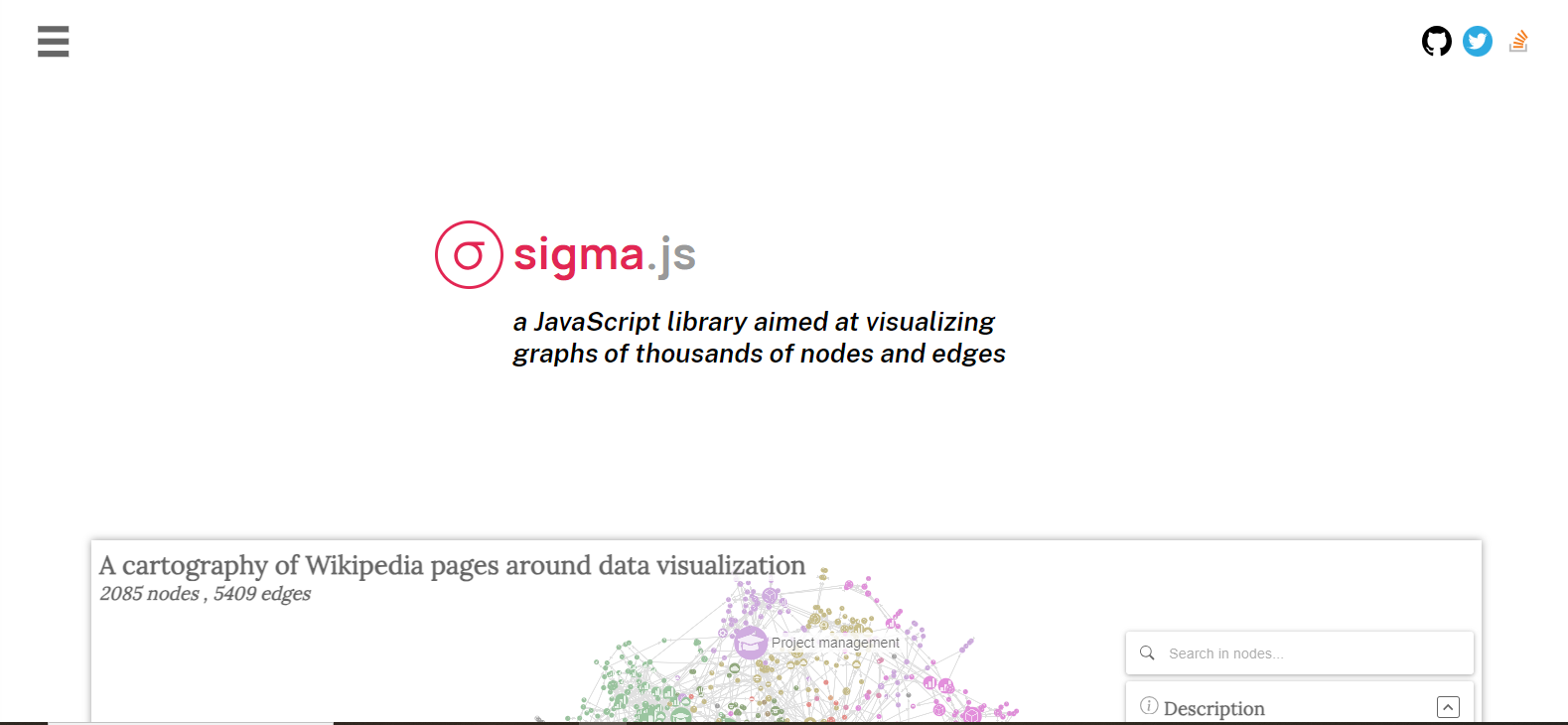
Sigma.js emerges as a specialized JavaScript library designed to meet the specific data visualization needs of associations dealing with complex network graphs.
Its primary strength is visualizing graphs composed of thousands of nodes and edges, making it ideal for associations looking to analyze and present large-scale networks.
Whether it's mapping social connections, organizational structures, or any other form of network data, Sigma.js provides a robust platform for rendering these intricate relationships in the browser.
Modern Library with Interactive Features
As a modern JavaScript library, Sigma.js is equipped with advanced rendering and interactive capabilities, allowing users to not only view but also interact with network graphs directly within the web environment.
This interactivity enhances the user's ability to explore the data, delve into specific nodes or connections, and gain deeper insights into the network's structure and dynamics.
Symbiotic Relationship with Graphology
Sigma.js works in symbiosis with Graphology, a versatile graph manipulation library. This partnership enables a seamless workflow from graph manipulation to visualization, offering a comprehensive set of tools for creating, analyzing, and displaying network graphs.
Graphology's multipurpose features complement Sigma.js's visualization strengths, providing associations with a powerful duo for handling all aspects of network graph data.
9. Polymaps (Maps)
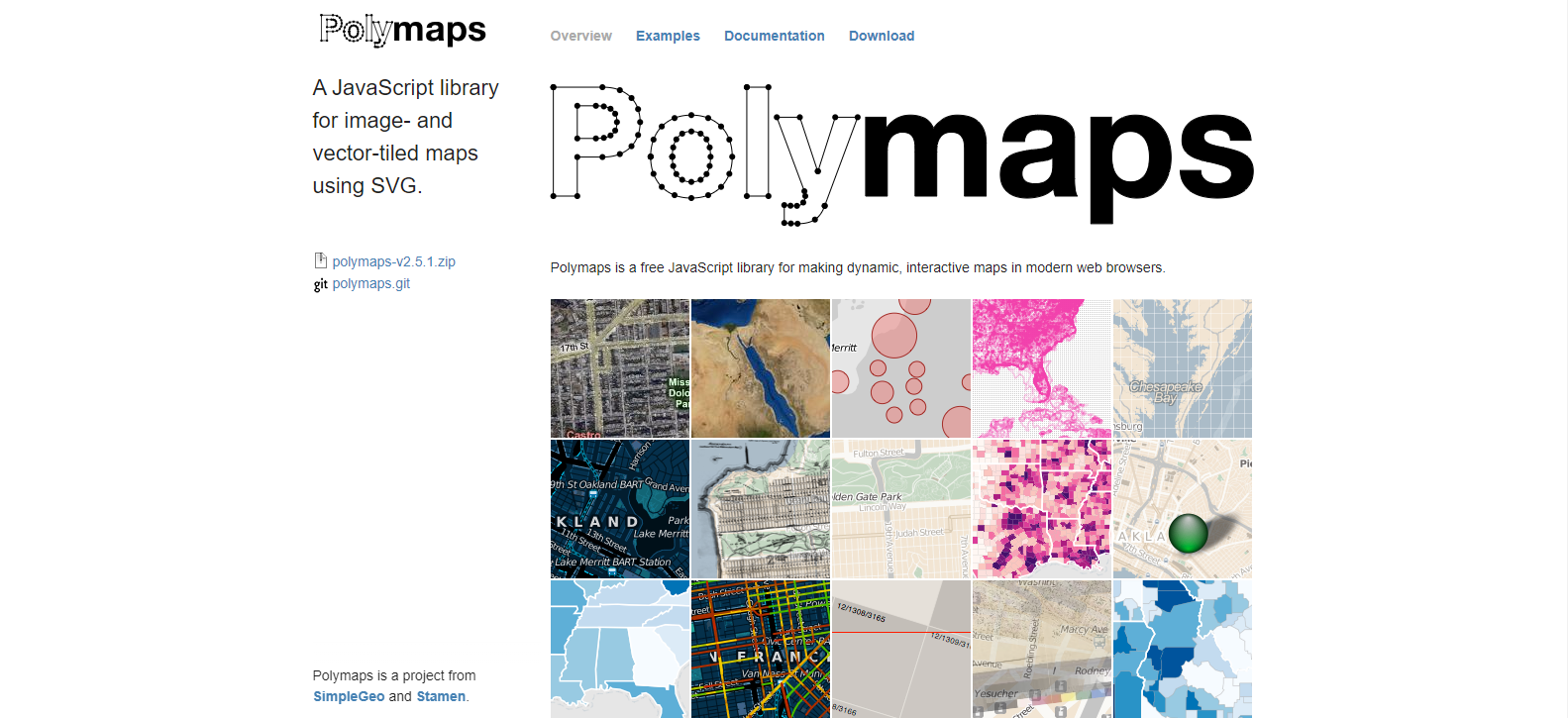
Polymaps emerges as a powerful JavaScript library tailored for associations that require sophisticated geographic data visualization. Its ability to render both image- and vector-tiled maps using Scalable Vector Graphics (SVG) sets it apart as a versatile tool for displaying a wide range of datasets on maps.
Polymaps supports a variety of visual presentations for tiled vector data, accommodating not just traditional cartography from providers like OpenStreetMap, CloudMade, and Bing but also allowing for customized, data-driven visualizations.
Optimized for Multi-Zoom Datasets
One of Polymaps' core strengths is its capability to efficiently display multi-zoom datasets, making it an ideal solution for visualizing information at various scales—from the country level down to states, cities, neighborhoods, and even individual streets.
This feature enables associations to tailor their geographic data presentations to their specific needs, ensuring that viewers can explore data in detail at any level of granularity.
Familiar Design Customization with CSS
Leveraging SVG for map displays, Polymaps allows associations to style their data using familiar CSS rules, offering comfort and flexibility in the design process.
This ease of customization ensures that associations can match the visual design of their maps to their branding and effective member communication strategies, enhancing the overall aesthetic and effectiveness of their data presentation.
Simplified Publishing with Spherical Mercator Tile Format
The use of the well-known spherical Mercator tile format for both imagery and data simplifies the process of publishing information with Polymaps.
This standardization facilitates the integration of geographic data with the library, making it straightforward for associations to create and share their maps with the public or specific audiences.
The Data-Driven Association: Unveiling the Benefits

In an era where data spreads at an unmatched rate, associations that adopt a data-driven approach position themselves at the forefront of efficiency, innovation, and stellar member experience.
Being data-driven involves leveraging data analytics and visualization to inform decision-making processes, strategic planning, and day-to-day operations.
Let's explore the benefits of being data-driven and how associations can utilize the power of data visualization to amplify their impact.
Enhanced Member Engagement
In the digital age, data visualization emerges as a powerful strategy for enhancing member engagement. It transforms complex datasets into visually appealing, easily digestible formats that not only inform but also intrigue and engage members.
The incorporation of charts, graphs, and infographics into communication materials can significantly amplify member engagement.
Statistics show that articles containing such visual elements garnered 16%- 34% more comments and shares, highlighting the increased interaction and interest generated through data visualization. This stat fits seamlessly into the narrative, underscoring the tangible impact of visual content on member engagement.
Data-Driven Decision Making
Data visualization plays a crucial role in empowering associations to pursue a data-driven decision-making approach. By transforming complex datasets into intuitive, graphical representations, data visualization enables organizations to quickly grasp the insights hidden within their data.
This clarity is instrumental in making informed decisions that are rooted in real-world data rather than intuition or guesswork.
A compelling statistic underscores the importance of a data-driven approach: Research has shown that organizations leveraging their customer behavior data to generate insights and make data-driven decisions can outperform their peers by as much as 85% in sales growth.
This remarkable figure highlights the significant advantage that data visualization provides in analyzing customer behavior, understanding market trends, and identifying opportunities for growth.
Improved Operational Efficiency
Data visualization tools significantly enhance operational efficiency for associations by simplifying the analysis of complex data, enabling quick identification of trends, patterns, and areas needing attention.
These tools foster effective communication across the organization, making key metrics and insights accessible to all members. Real-time communication and evidence-backed decision-making become streamlined, saving time and reducing operational costs.
By automating data analysis and reporting, associations can allocate resources more effectively, focus on strategic tasks, and uncover opportunities for improvement, leading to a more efficient operation overall.
Effective Communication
Data visualization tools enhance effective communication for associations by leveraging big data. These tools make information more accessible and understandable to a wider audience and ensure key insights are conveyed quickly and compellingly.
By presenting data in an intuitive format, associations can present better analysis, discussion, and collaboration among members and stakeholders.
Increased Transparency
Data visualization tools help associations increase transparency by making complex data easily understandable and accessible to all stakeholders.
By visually representing data, associations can clearly communicate their activities, outcomes, and financial status, fostering trust and accountability.
This openness allows members and the public to see the direct impact of the association's efforts, reinforcing credibility and encouraging greater involvement and support.
Visualize Data Better with Glue Up
Associations utilizing Glue Up's association management software stand to gain significant advantages from integrating data visualization tools compared to those using other platforms. Here's how Glue Up enhances the value of data visualization for associations:
Comprehensive Membership Insights
Glue Up's robust membership management feature, combined with data visualization, provides deeper insights into member behavior, preferences, and engagement levels. Associations can easily identify trends and tailor their strategies to more effectively meet member needs.
Enhanced Event Analysis
With Glue Up's event management capabilities, data visualization tools can offer a clear view of event performance, attendance rates, and participant feedback. This enables associations to make data-driven improvements to future events for increased success and member satisfaction.
Streamlined Financial Reporting
Integrating data visualization with Glue Up’s invoicing and payment features allows associations to monitor their financial health through interactive dashboards. This real-time financial data visualization aids in making informed budgeting and financial decisions.
Optimized Membership Workflows
By automating membership workflows with Glue Up and applying data visualization, associations can identify bottlenecks and inefficiencies in their processes. This leads to more streamlined operations and better resource allocation.
Personalized Data Dashboards
Glue Up’s customizable dashboard, enhanced with data visualization, enables associations to create tailored views of the most crucial data points. This personalized approach to data management ensures that associations can quickly access and act on the information that matters most to them.
In summary, associations using Glue Up can leverage data visualization tools to gain comprehensive insights into their operations, better understand member needs, and maintain a clear view of their financial health.
This integrated approach not only facilitates informed decision-making and enhances member engagement but also promotes overall organizational efficiency.
To see firsthand how Glue Up can transform your association's management capabilities and benefit from the power of data visualization, book a demo today. Discover the difference that a fully integrated association management platform can make.


