

Engaging your membership site's users and improving their experience should be a top priority. After all, without engaged members, a membership site won't survive for long. In this post, we'll provide 25 practical tips you can implement right away to enhance user experience on your membership platform.
From optimizing your onboarding process to leveraging social proof, these strategies will help you boost member participation, satisfaction, and retention. Read on to learn low-effort ways to make your site more user-friendly, increase perceived value, and drive the results that you’re looking for.
Key Takeaways:
- Focus on website speed, navigation, calls-to-action, and responsive design to improve user experience.
- Well-designed pages, consistent branding, and social proof like testimonials build trust and engagement.
- Optimizing individual pages and site-wide elements impacts the overall user journey.
- Testing your site and making improvements continuously is key to staying competitive.
What is Website User Experience?
Website user experience (UX) refers to how easy and satisfying it is for a visitor to use your website. It goes beyond visual design to include site speed, navigation, calls-to-action, and content.
The goal is to create an overall positive experience that delights users and keeps them engaged.
For membership websites, good UX is crucial for attracting, converting, and retaining members. If your site is difficult to navigate, cluttered, or slow to load, users will quickly become frustrated and leave.
By making your website intuitive, useful, and enjoyable to use, you can boost conversions and create brand advocates.
Here are 25 tips for dramatically improving UX on your membership website:
How to Improve Your Membership Website to Boost Member Engagement?
1. Leave Enough White Space in the Design
White space, or negative space, refers to empty areas around elements on a page. It helps reduce visual clutter and makes text, images, and calls-to-action stand out more.
Be generous with white space between sections, columns, paragraphs, images, buttons, and other elements. White space improves readability and draws the eye to important content.
In addition, make sure you use adequate margins and line spacing in your text.
2. Maintain Page Speed Optimization
Your site speed greatly impacts your visitors' experience and conversion rates. Pages that load slowly lead to high bounce rates, loss of trust, and poor SEO.
Thus, implement the following techniques to improve your page speed:
- Image compression - Reduce image file sizes without losing quality.
- Minification - Minify HTML, CSS, JavaScript, and other assets to reduce file size.
- Caching - Store assets locally so pages load faster on repeat visits.
- Lazy loading - Only load assets as they become visible on the page.
- Reduce redirects - Minimize HTTP requests.
- Enable compression - Gzip compress assets to reduce size.
- Optimize databases and code - Improve database queries and eliminate unused code.
3. Segment Key Information with Headings
Creating distinct sections by using descriptive headings is an effective way to organize information on your website. The headings introduce the topic of each section, highlighting the main takeaways or areas covered.
Keep headings concise, using important keywords and phrases. Make sure each heading stands out through size, color, or style so that your visitors can easily scan the page.
The use of headings also creates a clear outline structure for content. This improves readability and navigation. Your members quickly have to determine where to find the information they need. Headings form a hierarchy, starting with H1 tags for main headings, H2 subheadings, and so on.
This further segment information into digestible chunks and helps your members navigate your website for the information they are looking for.
4. Use Images Wisely
Relevant, high-quality images serve multiple purposes on web pages.
When used appropriately, they make pages more visually interesting and appealing. They break up large blocks of text, providing a visual resting place for readers. They also reinforce or illustrate key points, making them more memorable.
However, images should be carefully chosen to ensure that they truly enhance the user experience. They should load quickly, be optimized for size, and must have descriptive alt text.
Never use images purely for decoration. Each image should have a purpose, supporting the overall goals of the page and content. After all, a well-chosen image improves the engagement and understanding of your message.
Read more: How to Create a Winning Member Engagement Strategy for Your Association? [An In-Depth Guide With Tips, Checklists, and FAQS]
5. Keep Your Website Pages Consistent
Consistency across all website pages is essential for an effective user experience.
Maintaining consistent design, branding, tone, navigation, and structure helps create familiarity for visitors. When your pages follow similar templates and patterns, users know what to expect. They can focus on content rather than learning new navigation or layouts.
A consistent experience can also help you build trust and confidence. It gives your site a professional and unified feel.
Strive for coherence through the use of common headers, footers, menus, and page elements. However, allow for some flexibility to make important pages, like the homepage, stand out.
6. Don’t Let Your 404s Get Away
When you move or delete pages, it's important that you set up redirects to prevent dead 404 error pages. These frustrating dead ends undermine credibility and can cause users to leave.
Create custom 404 pages that gently guide visitors back to relevant content. Include links, your navigation, and a search bar. A bit of humor doesn't hurt either. The good news is that 404s are not necessarily lost opportunities when handled well.
7. Make It Responsive and Mobile-Friendly
With the rapid growth of mobile device usage compared to desktop computers, having a responsive web design has become essential. A responsive design adapts the layout and content to fit different screen sizes, from desktop monitors to mobile phones.
To create a mobile-friendly experience:
- Use a flexible grid layout that adjusts column widths based on the viewport width.
- Ensure tap targets like buttons and links are large enough for fingers on touch screens.
- Optimize images and videos by serving smaller file sizes to mobile users to accommodate slower connections and limited data plans.
- Use web fonts and font sizes that are legible on small screens.
- Minify CSS, JavaScript, and HTML files to reduce load times and
- Implement caching and lazy loading of below-the-fold content.
Optimizing for mobile improves accessibility for all users. By meeting mobile user needs, you can cement loyalty and provide a seamless experience across devices.
8. Use Tabs and Accordions Sparingly
The majority of website visitors prefer scanning instead of clicking to reveal information. Tabs and accordions force people to take an extra step to access content, which most visitors don't want to do.
It's better to have your key information readily visible on the page instead of tucked away. Scannable content in plain sight improves the user experience. Visitors can quickly find what they need without extra clicks.
9. Add a Value Proposition
Clearly explain on your site how your membership programs provide value to your members. This instills confidence in your potential members and gives them a compelling reason to move forward.
The value proposition should be prominently displayed on your website, such as in the header or on the homepage. Use clear, concise language that speaks directly to your members and their needs. Avoid generic claims and instead be specific about the tangible outcomes and advantages you offer.
Back up your claims with evidence like testimonials, case studies, statistics, or awards. This builds trust and credibility. Infographics, videos, or other visuals demonstrating your value can also be persuasive.
Your value proposition should be prominent, and specific, and convey the unique benefits you offer.
10. Improve Your Website Navigation
An intuitive, user-friendly navigation system is vital for helping visitors easily find what they need on your site.
The main navigation menu should be prominently displayed across all pages, typically near the top. Organize menu items logically, with the most important pages given priority. Use clear, descriptive labels that match what users are looking for.
Secondary navigation can provide access to subpages and more granular content. Breadcrumb trails are helpful for showing location within a site's hierarchy. Include a search bar to let visitors quickly look up keywords.
Streamline menus by eliminating redundant or low-value pages. Avoid overstuffed navigation that creates clutter. Review analytics to see which pages attract traffic and which don't.
Effective navigation minimizes confusion by guiding users to their desired content with minimal clicks. This improves time on site, page views, and conversion rates.
11. Be Careful with Social Media Icons
Placing social media icons prominently at the top of a webpage can be distracting and drive visitors away. When people first land on your site, you want their focus on your content or membership benefits.
To increase conversions, put your social media links at the bottom of the page instead. Down there they are handy for users who wish to connect but don't interrupt the user flow.
12. Never Overcrowd Your Site
A clean, uncluttered design is essential for an enjoyable user experience. Although a website requires many components to function properly, overcrowding the page creates visual chaos.
Follow modern web design principles of using plenty of whitespace and keeping the layout simple. Avoid cramming in too many images, widgets, menus, and other elements. Allow breathing room between items.
Ample whitespace and minimal visual complexity feel open and inviting.
13. Add Prominent CTAs
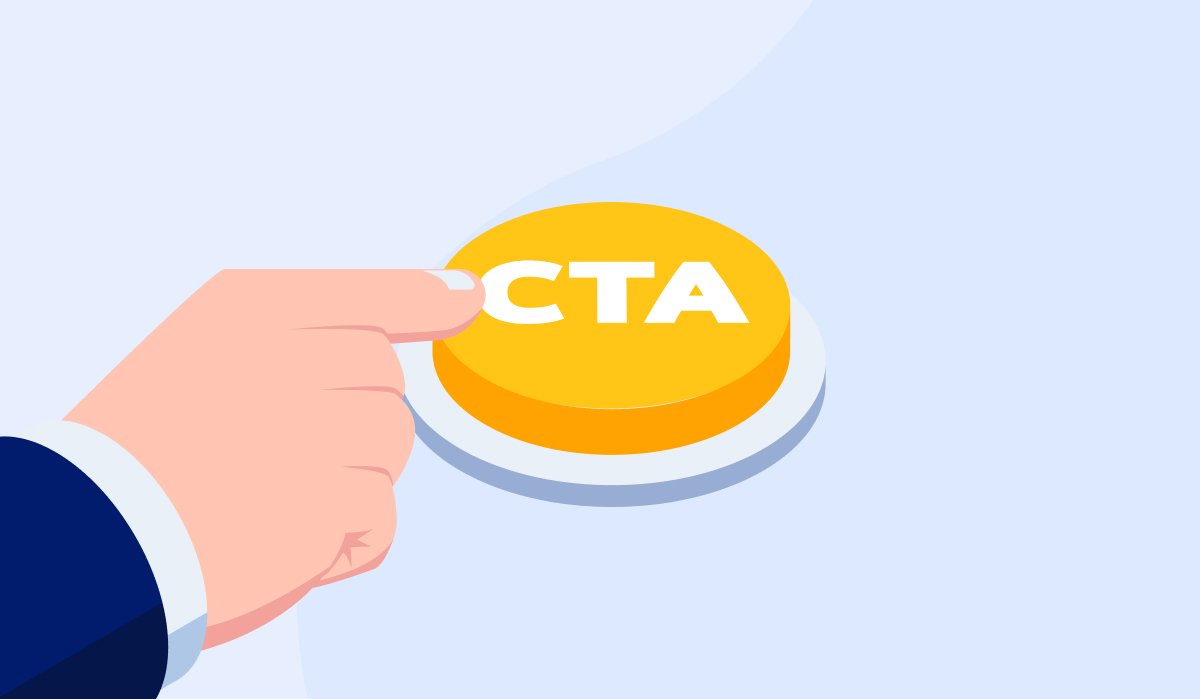
Compelling calls-to-action (CTAs) are crucial for converting your website visitors into leads and then members. They should use action-oriented language and create a sense of urgency or excitement to motivate users.
For example, "Start Your Free Trial" or "Download Now" work better than just "Sign Up" or "Get the Guide."
Here are some key points you should remember when writing CTAs:
- Use action verbs like "Get", "Join", "Start", and "Register"!
- Create urgency with "Limited Time Offer" or "Sale Ends Soon."
- Use descriptive language: "Get Your Free Trial."
- Avoid passive voice: "Join Now" not "Now Joining."
- Speak directly to the user: "Join our community."
- Be specific about the action: "Download Your Guide."
- Use power words: Discover, Improve, Act, Reserve
- Keep it simple and scannable.
14. Put Emphasis on the Colors of the CTAs
Using high-contrast colors for calls-to-action (CTAs) helps them stand out on the page. Bright hues like green, blue, and red work well as they grab the viewer's attention.
When choosing CTA colors, make sure they contrast well with the overall color scheme of your site. For example, a bright green button stands out nicely on a page with a white or gray background.
Having clear visual contrast helps draw the user's eye to the most important actions you want them to take.
15. Try The 10-Foot Test
The "10-foot test" refers to viewing your website from about 10 feet away, simulating the experience on a large monitor or TV screen. This helps evaluate the readability and usability of your site design.
From that distance, text should be clearly legible without straining to read. Buttons and other clickable elements need to be prominent enough to easily spot and tap/click.
If any text appears too small to make out, increase font sizes and spacing. For hard-to-see buttons, adjust their size, color contrast, and placement.
The 10-foot test reveals issues that may not be noticeable up close, like text that's too small for big screens. Making adjustments for readability from afar improves accessibility and usability for all users, on all devices.
16. Don’t Overuse Carousels
Carousels and image sliders can be useful for showcasing visual content but use them with caution. They take up prime real estate on a page, and automatically rotating through images can distract users.
Static hero images often convert better. If you do use a carousel, make sure each slide highlights a clear message or call-to-action. Keep the number of slides minimal to avoid overwhelming users.
Also, ensure your key messages are represented elsewhere on the page outside the carousel.
17. Add Social Proofs

Displaying social proof like awards, testimonials, and reviews helps build trust and credibility for your brand.
Select a few strong examples representing your members and keep the design clean. Avoid cluttering the page with excessive social proof. Aim for quality over quantity, as a few relevant, enthusiastic testimonials or prominent logos make a stronger impact than a dozen generic ones.
Use this checklist when creating social proofs:
- If you have user-generated content like member photos or videos, include some strong examples.
- Publish the number of subscribers, followers, group members, etc. to demonstrate a large community.
- Feature ratings from trusted third-party review sites.
- The key is to select social proof elements tailored to your business and audience. Aim for diversity across the examples you highlight.
18. Create Testimonial Pages
Dedicate a separate page or section of your website to showcase detailed stories and testimonials from satisfied members. These should highlight specific ways your product or service helped improve their lives or solve a problem.
Use quotes and full paragraphs to provide rich details. You can also include photos, videos, or audio clips to make the testimonials more engaging. The key is crafting member stories that demonstrate the true value your company provides.
19. Create a Team Page
Create a page for your team members with bios that provide background on their experience, skills, education, and interests. This allows your potential members to get to know the real people behind your company and make personal connections.
Share fun facts and tidbits that humanize your staff. You can also include photos and links to social media profiles. The goal is to build rapport and help visitors see your team members as approachable experts they can trust.
20. Include Internal Links
Linking related content together throughout your website improves navigation and connections for users. But avoid over-linking which can dilute individual page authority.
Focus on linking deeper pages and blog posts back to high authority starting points like your home page, category pages, and popular articles. Make sure related content within posts is linked for easy access. Ensure site search results properly link back to corresponding pages.
Double check navigation menus, calls-to-action buttons, images, and other elements have appropriate links set up. Use descriptive anchor text that provides context.
Smart internal linking makes it easy for visitors to seamlessly find what they need or discover new relevant content. This increases time on site, pages per session, and conversion rates.
21. Add Email Signup Forms

Include email signup forms in strategic spots across your website, allowing visitors to easily subscribe to receive updates and valuable content from you.
Place them prominently on the home page, blog, contact pages, popups, and navigation. Offer a compelling incentive for signing up like exclusive content, discounts, or giveaways.
Send a welcome email introducing new subscribers to your organization. Then continue nurturing contacts by sending helpful and relevant content on a regular basis.
22. Forget the Fold
With so many varying screen sizes and devices today, from desktop monitors to mobile phones, don’t get preoccupied with what content sits “above the fold” or at the top of the page. Instead, focus on clearly conveying your core value proposition and primary calls to action anywhere on the page.
Use clear and concise headlines, subheads, and bullet points to quickly communicate key messages to visitors. Break up long blocks of text with relevant images and graphics. Optimize all content for easy skimming by users. Strategically place your main calls to action both above and below the fold to ensure maximum visibility.
Prioritize content that speaks to your ideal customer and encourages them to take action. Drive visitors further down the page with scrolling effects, visuals, and clickable elements.
Evaluate your page layout on multiple devices to identify content placement blind spots. Test different CTAs and content arrangements through A/B testing.
23. Know When to Use Email Addresses and Contact forms
Listing a specific email address like contact@yourcompany.com makes it straightforward for visitors to get in touch and start a conversation. This removes the extra steps of filling out lengthy contact forms which can be frustrating.
But avoid spam and abuse by using a protected email address with a domain name specific to your business, versus listing info@ or marketing@ which are common targets. You can visibly include the email address in the header, footer, and contact page. Just be sure to monitor the inbox diligently and set up filters as needed.
As an alternative for client questions, or other complex submissions, use multi-field contact forms which give you more control and organization.
Customize form fields, require certain inputs, route messages by purpose, and automatically collect extra details like name, company, and location. Forms also help prevent typos.
Let visitors choose from a dropdown menu of subjects to classify the reason for their message. Lastly, don't forget to add captcha verification to prevent spam.
24. Add Thank You Pages
After a potential member sign up, downloads content, or fills out a form, send them to a custom thank you page reinforcing the action just taken.
Thank you pages present opportunities to provide next steps, additional resources, special discounts, or upsell offers. You can also suggest related content based on what they just did. An excellent thank you page continues nurturing contacts and moving them down the membership funnel.
25. Test and Refine Your Website
No website is ever complete. To attract visitors and convert them into members successfully, you need to continually test and optimize your site. Use web analytics to identify weak points and opportunities for improvement. Monitor user behavior and make changes accordingly.
Stay current with the latest web design trends and best practices. As your organization evolves, update your website to match. A website is never "done". There is always room for improvement and refinement.
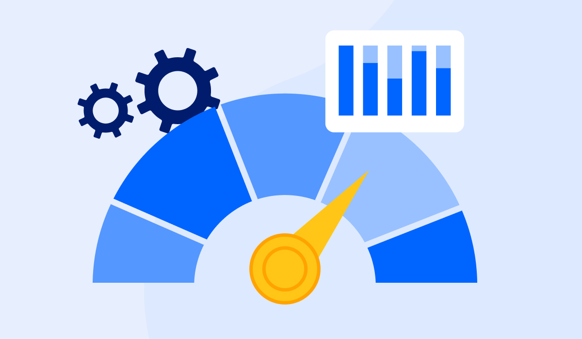
Evaluate Your Website with Glue Up’s Website Grader
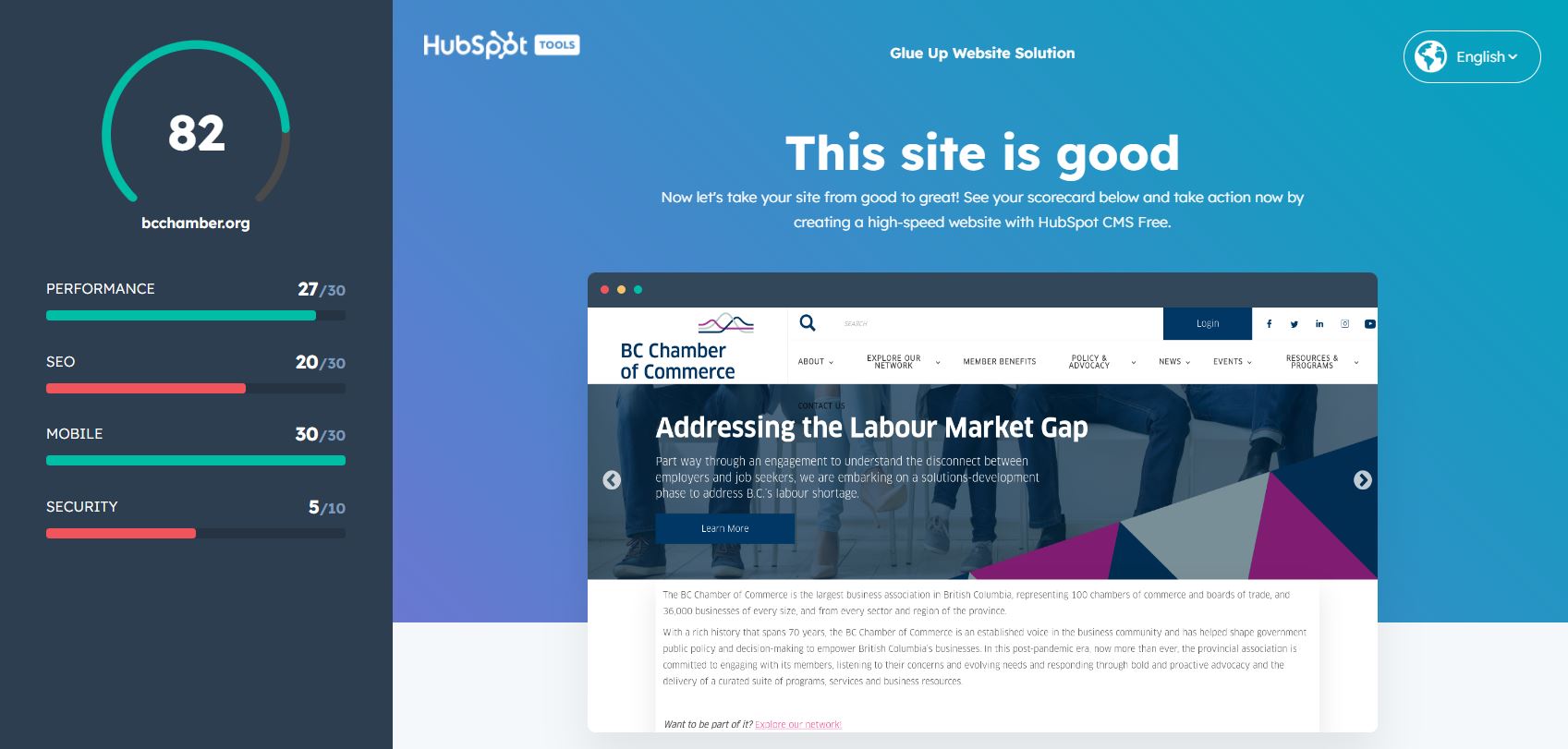
If your organization already has a website, it's important to periodically evaluate its performance, user experience, and design.
Glue Up offers a free website grading tool that can analyze your current site and provide a report with tips for improvement.
Here are some important aspects you can uncover with our website grader:
- Mobile friendliness and responsiveness
- Page load speeds
- SEO optimization
- Broken links or errors
- Overall aesthetics and design
Running your site through the grader can uncover issues you may not have noticed and provide data-driven suggestions for enhancements. This can help you prioritize what to update first to improve usability and conversions.
Click here to check how effective is your website and get your scores instantly.
Examples of Effective Membership Websites
1. Association of International Certified Professional Accountants (AICPA)
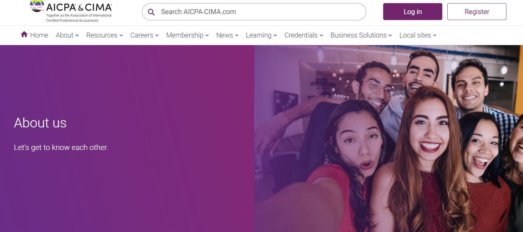
When it comes to the best membership websites, AICPA takes one of the top spots.
AICPA’s website is a wealth of invaluable resources designed with the user in mind. The site is organized into clear sections catered to different membership categories, making navigation straightforward.
Its color scheme is not only professional but also vibrant, mirroring the dynamic and evolving accounting profession.
Exclusive content and additional resources are available to members who sign into their accounts, further enhancing the worth and functionality of their memberships.
2. AFP Golden Gate

The AFP Golden Gate Chapter is committed to embedding the IDEA principles (Inclusion, Diversity, Equity, Access) in all aspects of its operations including governance, committee initiatives, programs, opportunities, and engaging members.
The chapter's website, reflecting this vision, aims to be a platform that encourages generosity and meaningful societal contributions by applying the best practices in fundraising.
Their friendly landing page stands out as a distinctive feature, offering visitors an instant understanding of the organization and its plethora of activities. Additionally, their homepage clearly delineates forthcoming events and programs, complete with details of dates and times to facilitate easy planning for participants.
How AFP Golden Gate Revamped Its Website with Glue Up?
By harnessing the power of Glue Up’s website solution, AFP Golden Gate not only refreshed its online presence but also created a website that genuinely mirrors the organization's essence. The website boasts a user-friendly design and intuitive navigation, ensuring visitors have a smooth and delightful browsing experience.
Furthermore, Glue Up provided them with easy-to-use AMS features, allowing them to easily manage member logins, private pages, event registrations, and interactive forms. If you’re also looking to give your website a new look, click here to get in touch with our experts today.
FAQs
1. What is user experience, and why is it crucial for a membership website?
User experience (UX) refers to how visitors interact with and perceive your website. For a membership site, a positive UX is vital because it directly impacts member engagement and retention.
It influences how users navigate, access content, and interact with your community.
2. Can you provide some quick tips to enhance the user experience on my membership website?
Sure, there are several quick tips to improve UX, such as optimizing site speed, creating a clear navigation structure, and ensuring mobile responsiveness. These are just a few of the actionable tips you'll find in our blog to boost member engagement.
3. How do I know if my membership website needs improvements in user experience?
Signs that your website needs UX improvements include high bounce rates, low member retention, or complaints about navigation difficulties.
Regularly analyzing user feedback and website analytics can help you identify areas that need enhancement. You can also grade your website for free using Glue Up’s website grader.
4. What role does content play in improving member engagement on a membership website?
Content is a cornerstone of member engagement. High-quality, relevant, and updated content keeps members coming back for more. In our blog, we'll provide tips on content strategy and presentation to boost user engagement.
![A Guide to Membership Launch [Types, Tips, and Strategy]](/sites/default/files/styles/all_blogs_block_img_384x192/public/2024-05/image_1_header_1536x768%20%283%29.webp?itok=SYcoAKgB "A Guide to Membership Launch [Types, Tips, and Strategy]")

